Creating an interactive data gating tool with plotly and shiny in R
R ShinyInteractive data gating allows researchers to visually select and analyze specific subsets of data points from complex data sets. This is particularly valuable in bioinformatics, where we often need to select clusters of points from large data sets - such as identifying a cell phenotype in a mixed population using molecular markers.

The shiny package for R (and now also for Python) makes it easy to create interactive web applications to communicate our results. This is extremely useful for communicating research that generates high volumes of data such as bioinformatics. Rather than compressing all our results down into a few summary plots and interesting examples (which we hope will be of interest to our readers), we can create a web interface that lets the user decide which genes, proteins or methylation sites they are interested in and re-actively generate their own plots through a simple graphical interface.
Shiny apps are written in R and run in R, meaning that users can create websites that harness the full range of bioinformatics, graphics and statistical tools available in the R software universe. Check out this gallery of featured demos and user submissions. for some inspiration.
Whilst most tutorials focus on creating visualisations of the results of an analysis, shiny is also great for creating graphical interfaces that let us work with our own data in a more intuitive way.
Here I will show an example where I created a mini-app that lets the user (me) draw a gate around a set of points on a 2D plot, and returns the coordinates of the gate that is drawn. I often use this app when analysing single-cell data, where I want to select a cluster of cells identified by two fluorescence intensity markers (in a high-content microscopy experiment) or the expression of two genes (in a single-cell RNAseq experiment), in much the same way as phenotypic clusters of cells are selected by gating in flow cytometry software such as FlowJo.
A note on non-standard evaluation in R
In this tutorial, I use tidy evaluation to describe variables in the functions that we will define. This means that you can pass them directly by name rather than using a string, just as you do in dplyr and ggplot. For the variables to be correctly parsed by the function, you must enclose them with either {{}} or !!ensym(). Whilst it adds a little visual complexity to the code, it makes it much easier to later integrate with other tidy functions. For more info see the programming with dplyr page.
Create the plotting function with ggplotly
plot_intensity_2d = function(data, channel_1, channel_2){

  plot = data %>%
    ggplot2::ggplot() +
    ggplot2::aes(x = !!ensym(channel_1), y = !!ensym(channel_2), fill = sqrt(after_stat(count))) +
    ggplot2::geom_bin2d(bins = 500) +
    viridis::scale_fill_viridis() +
    ggplot2::theme_bw()

  plot = plotly::ggplotly(plot)

  return(plot)
}
Note that I am explicitly naming the packages that our plotting function comes from using ggplot2::. This is very helpful when writing code intended to be shared by others, as it prevents errors from popping up if they have other packages loaded with overlapping function names.
Given this is biological data, let’s also add a few more lines to our function to handle outliers or very large data sets.
# First, remove any data grouping so that we can apply our clean up equally to all data points
  data = data %>%
    dplyr::ungroup()

# Subsample data if it has more than 500,000 rows. This avoids performance issues when working with very large data-sets. It's unlikely that we need to include more than 500,000 points to set a gate.
  if(nrow(data) > 500000){
    data = data %>%
      dplyr::sample_n(500000)
  }

# Set limits for our plot that remove extreme outliers
  lim_x = data %>%
    dplyr::pull(!!ensym(channel_1)) %>%
    quantile(c(0.001, 0.999), na.rm = T)

  lim_y = data %>%
    dplyr::pull(!!ensym(channel_2)) %>%
    quantile(c(0.001, 0.999), na.rm = T)
If using these extra functions, remember to also add ggplot2::lims(x = lim_x, y = lim_y) to ggplot call.
Test it out
Let’s try out our function with the diamonds dat aset.
data("diamonds")

plot_intensity_2d(diamonds, carat, price)
## Warning: Removed 179 rows containing non-finite values (`stat_bin2d()`).
Unlike ggplot2, which creates a static graphic, plotly creates an interactive graphic interface with a toolbar that lets the user zoom on data and also select data with a lasso tool.
Create the user interface with Shiny and miniUI
We can draw a lasso around points of interest, but how do we actually get that data out and back into R. That is, how do we get the coordinates of the gate and the points within, to make this a truly useful graphical selection tool. For this, we wrap the plotting function into a shiny app that displays the plot and returns the gate information:
interactive_data_select <-
  function(data, channel_1, channel_2) {

    ui = miniUI::miniPage(
      miniUI::gadgetTitleBar("Daniel's interactive data select"),
      # Render plot
      plotly::plotlyOutput("plot"))

    server = function(input, output) {

      output$plot <- plotly::renderPlotly({
        p = plot_intensity_2d(data, !!rlang::ensym(channel_1),!!rlang::ensym(channel_2))

        p %>%
          plotly::layout(dragmode = 'lasso') %>%
          plotly::event_register("plotly_brushed")

      })

      brushed_values = shiny::reactive(plotly::event_data("plotly_brushed"))

      shiny::observe({
        if(input$done){
          shiny::stopApp(brushed_values())}
      })

      shiny::observeEvent(input$cancel, {
        shiny::stopApp()
      })
    }

    shiny::runGadget(ui, server)
  }
There are quite a few nested steps here, so let’s break it down.
At the top level, we define the function inputs for interactive_data_select, which we will then pass to our plot function. The body of the function calls the three steps we need to create our interface:
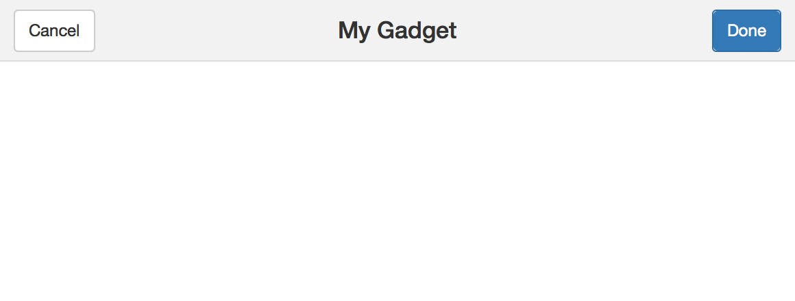
miniUI::miniPage()defines the user interface - i.e. the layout of the web app. If you have usedshinybefore, then you will be familiar with the standard layouts built into the package, such aspage_sidebar(), which creates a blank web page with a sidebar. TheminiUIlibrary provides a set of minimal mini-layouts that are perfect for making small data tools such as this. Within this, we callminiUI::gadgetTitleBar(), which makes a gadget containing a title,cancelanddonebuttons like below. Here we also include the function to render our plotplotly::plotlyOutput().
-
Next we define the shiny server, which is the back end that produces the plot and defines its behaviour. Just like a regular shiny app, the server is defined as a function
server = function(input, output).In here, we create the plot using our
plot_intensity_2d()function and perform two extra steps:plotly::layout(dragmode = 'lasso')sets the plotly pointer to the lasso select tool, andplotly::event_register("plotly_brushed")asks it to record information on the lasso gate chosen by the user.We then assign those values to the
brushed_valuesobject withshiny::reactive(plotly::event_data("plotly_brushed")). When the user clicks the done button in the gadget, we close the app and return the values to the R session withshiny::stopApp(brushed_values()). Note that, becausebrushed_valuesis a reactively generated value, we must call it as a function to return its value. -
Lastly, we run the app using the function
shiny::runGadget(). Unlikeshiny::shinyApp(), this function doesn’t open a new web browser but runs the app directly in the RStudio Viewer panel.
Try it for yourself
If you want to try out these functions, you can also find them in my R package of handy tools for biological image analysis on GitHub, which includes these functions with their associated documentation. Install it with devtools::install_github("danielgreenwood/imageToolkit"). Have a go by running gate <- interactive_data_select(diamonds, carat, price), select some data points with the lasso, click done and see the result. It should return a list of x and y coordinates (in the units of carat and price) which you can then set as a gate to identify these points.
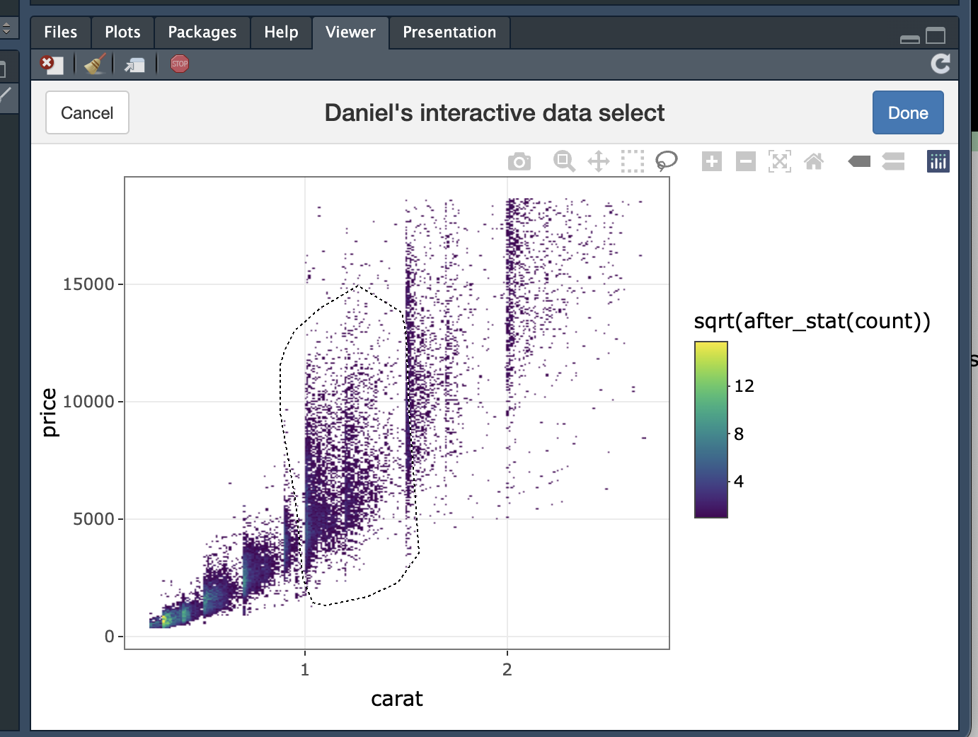
$x
  [1] 1.1949570 1.0695582 0.9441594 0.9337095 0.9406761 0.9546093 0.9546093
  [8] 1.0138254 1.0974246 1.2646230 1.3099058 1.4283380 1.4736209 1.5119372
  [15] 1.5154205 1.4980040 1.4805875 1.4144048
$y
  [1] 13412.5323 12858.1923 11071.9857 10332.8657  8300.2857  5898.1457
  [7]  1648.2056   847.4923   477.9323  1709.7990  1832.9856  2818.4790
  [13]  3680.7856  5590.1790  9100.9990 12611.8190 13227.7523 13720.4990
As always, if you have any feedback or suggestions then get in touch using the links in the footer.
sessionInfo()
## R version 4.3.3 (2024-02-29)
## Platform: aarch64-apple-darwin20 (64-bit)
## Running under: macOS Sonoma 14.4.1
##
## Matrix products: default
## BLAS:   /Library/Frameworks/R.framework/Versions/4.3-arm64/Resources/lib/libRblas.0.dylib
## LAPACK: /Library/Frameworks/R.framework/Versions/4.3-arm64/Resources/lib/libRlapack.dylib;  LAPACK version 3.11.0
##
## locale:
## [1] en_US.UTF-8/en_US.UTF-8/en_US.UTF-8/C/en_US.UTF-8/en_US.UTF-8
##
## time zone: Europe/Zurich
## tzcode source: internal
##
## attached base packages:
## [1] stats     graphics  grDevices utils     datasets  methods   base
##
## other attached packages:
##  [1] shiny_1.8.1.1   lubridate_1.9.2 forcats_1.0.0   stringr_1.5.0
##  [5] dplyr_1.1.3     purrr_1.0.2     readr_2.1.4     tidyr_1.3.0
##  [9] tibble_3.2.1    tidyverse_2.0.0 plotly_4.10.4   ggplot2_3.4.3
##
## loaded via a namespace (and not attached):
##  [1] viridis_0.6.4     sass_0.4.9        utf8_1.2.3        generics_0.1.3
##  [5] blogdown_1.19.1   stringi_1.7.12    hms_1.1.3         digest_0.6.35
##  [9] magrittr_2.0.3    timechange_0.2.0  evaluate_0.23     grid_4.3.3
## [13] bookdown_0.39     fastmap_1.1.1     jsonlite_1.8.8    gridExtra_2.3
## [17] promises_1.3.0    httr_1.4.7        fansi_1.0.4       crosstalk_1.2.1
## [21] viridisLite_0.4.2 scales_1.2.1      lazyeval_0.2.2    jquerylib_0.1.4
## [25] cli_3.6.2         rlang_1.1.3       munsell_0.5.0     withr_3.0.0
## [29] cachem_1.0.8      yaml_2.3.8        tools_4.3.3       tzdb_0.4.0
## [33] colorspace_2.1-0  httpuv_1.6.15     mime_0.12         vctrs_0.6.5
## [37] R6_2.5.1          lifecycle_1.0.4   htmlwidgets_1.6.2 pkgconfig_2.0.3
## [41] later_1.3.2       pillar_1.9.0      bslib_0.7.0       gtable_0.3.4
## [45] Rcpp_1.0.12       data.table_1.14.8 glue_1.7.0        xfun_0.43
## [49] tidyselect_1.2.1  rstudioapi_0.15.0 knitr_1.45        farver_2.1.1
## [53] xtable_1.8-4      htmltools_0.5.8.1 labeling_0.4.3    rmarkdown_2.26
## [57] compiler_4.3.3